Customization
Overview
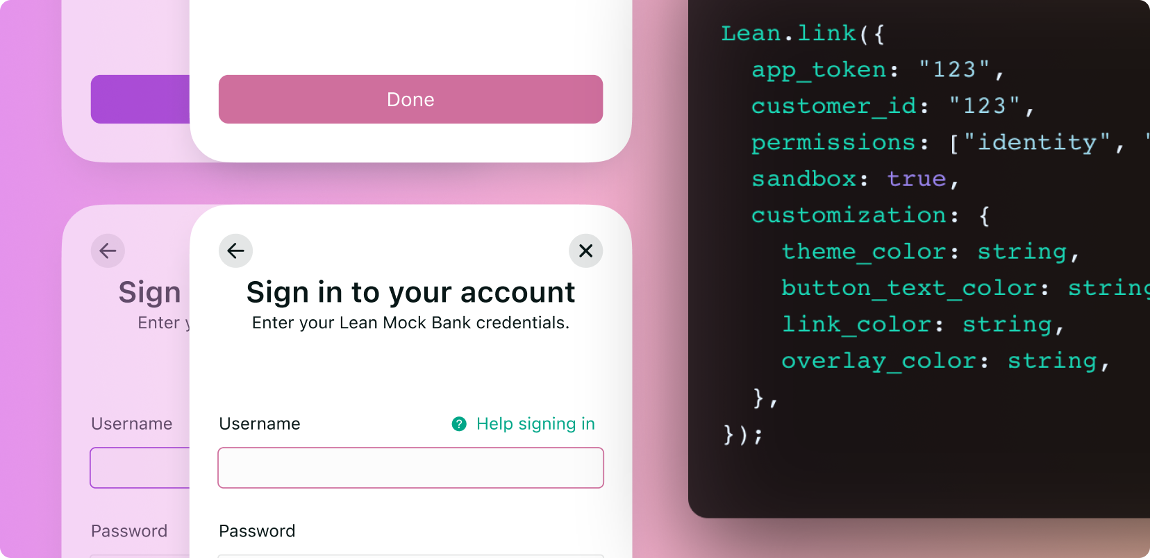
This guide will walk you through the customization features provided and our recommendations to help your customers trust any interactions with Link SDK. These properties allow our customers to match Link SDK UI colors with those of their own branding.
Add your Company Logo on the LinkSDK
We allow the addition of a logo on the "Link your account" page of the LinkSDK.
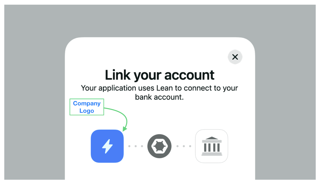
To add the logo, you will need to navigate to the "Settings" section in the Lean Developer Account. It's that simple!
Optimal dimensions for the logoWe highly recommend adding a 400px x 400px square logo to ensure best rendering across all platforms
Planning customization
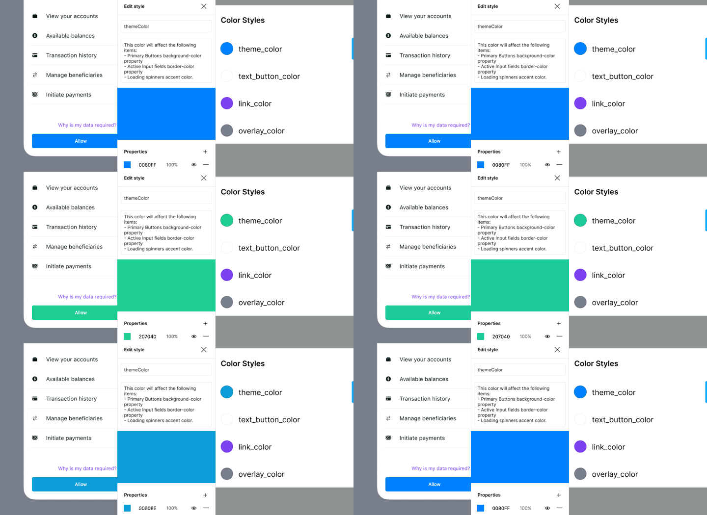
Making visual changes to the Link SDK flows has an impact on your conversion performance. Before updating your build, we recommend planning and testing the ideal customization using our Link SDK Figma community file. This is an easy and interactive way to visualize how well any changes you make to the SDK will match your brand and context within your application.
To edit the colors, you must edit the styles stored directly. These reflect the values passed over the configuration of any of the Link methods.
Duplicate our Link SDK Figma Community file
Customization properties
The following properties are now included within the customization object and are optional, depending your preferences. This guide will cover web implementations. Read more within the Link SDK reference page.
Lean.connect({
  app_token: "123",
  customer_id: "123",
  permissions: ["identity", "balance", "accounts", "transactions"],
  sandbox: true,
  customization: {
    dialog_mode: string,
    theme_color: string,
    button_text_color: string,
    button_border_radius: string,
    link_color: string,
    overlay_color: string,
  },
});
Dialog mode
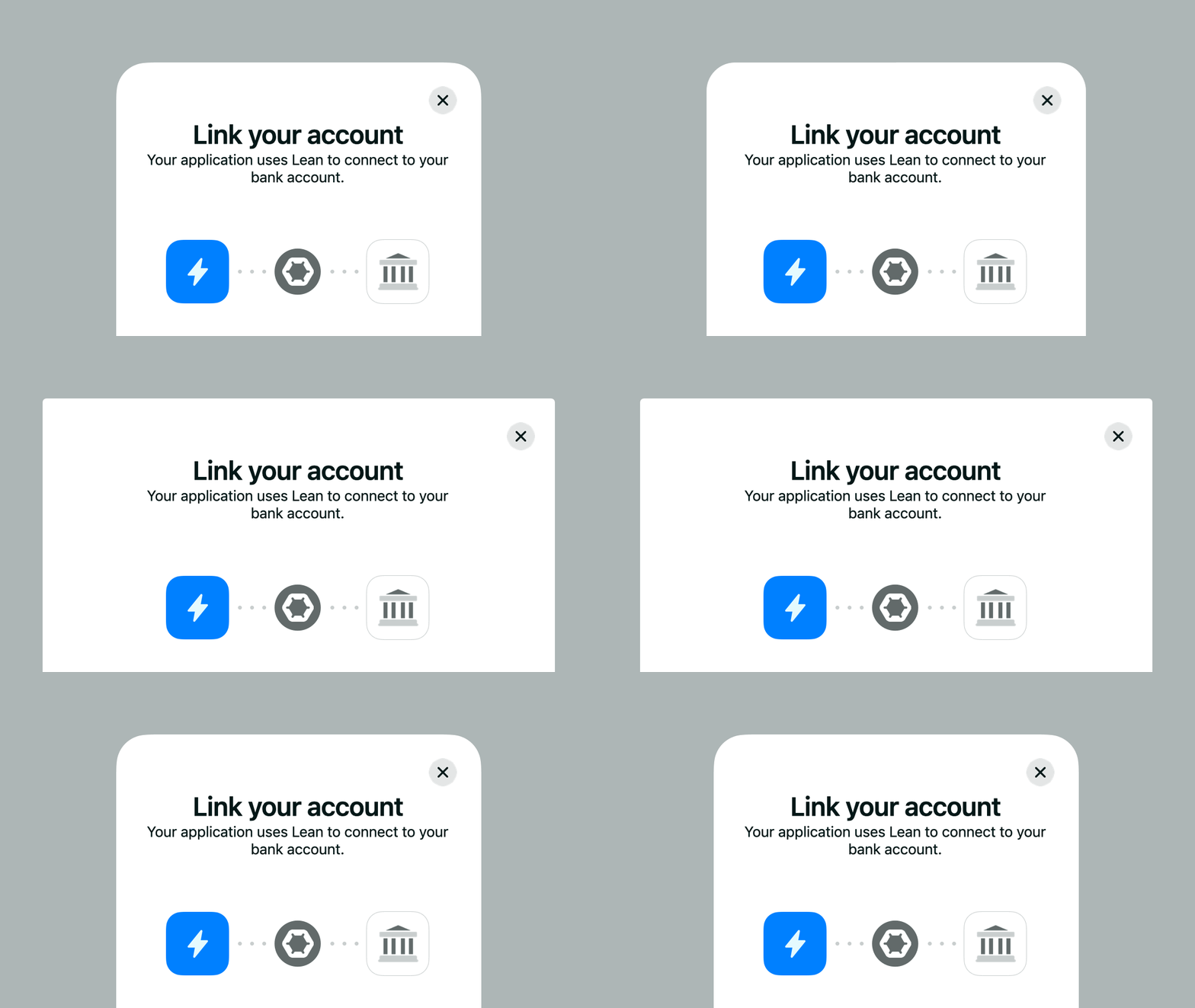
The Link SDK is designed to be used as a dialog pop-up out of the box. To extend beyond its shape to any parent container set the dialog_mode property to "uncontained". This property is specially useful if your application relies on native modal sheets or if your design system already has a different set of properties for modals such as border-radius, drop shadow or transitions.
Theme color
The theme_color property passes a color to the button background-color, the input border when it's active and the loading spinners primary color.
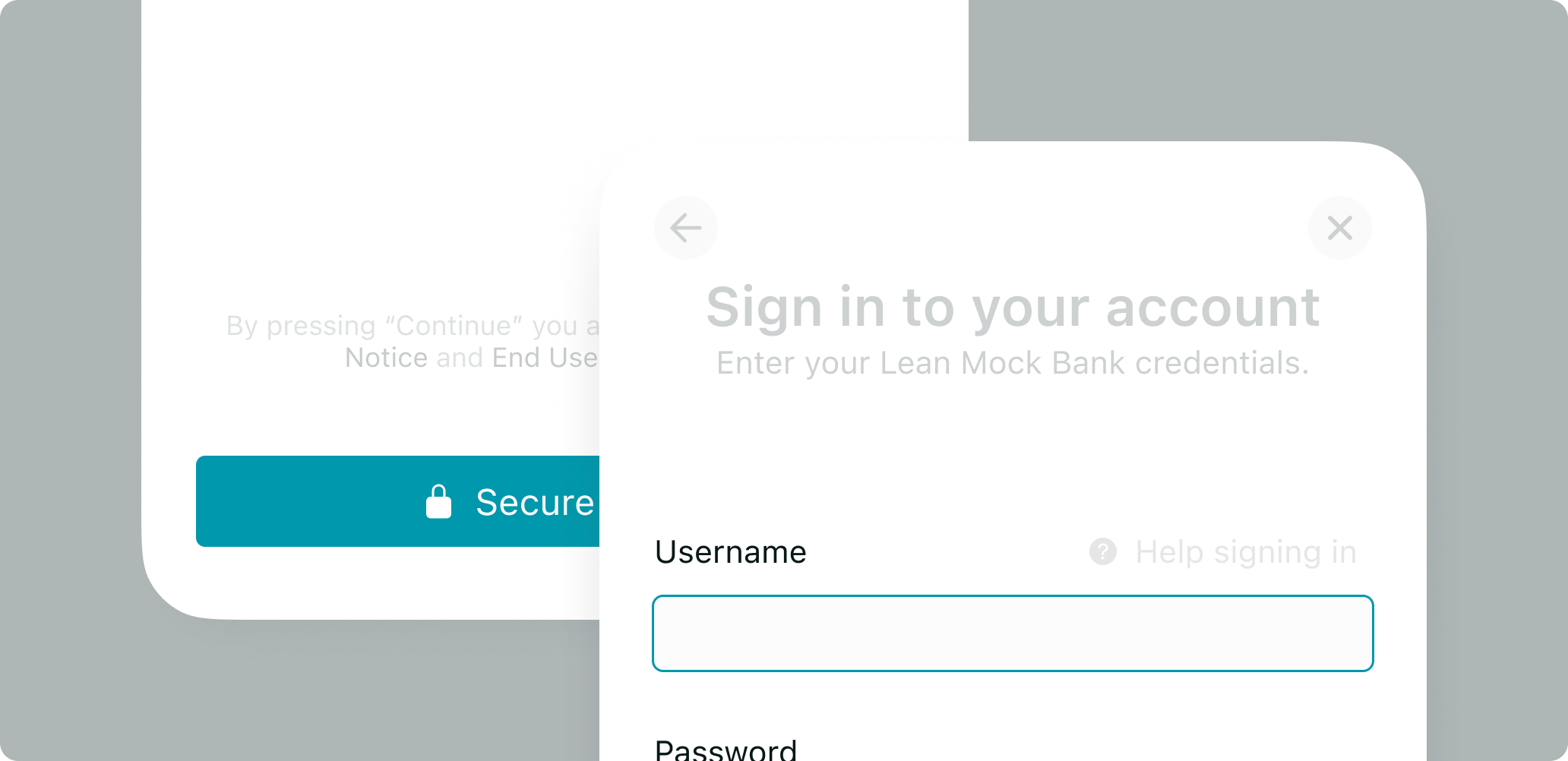
Button text color
By default Link SDK uses absolute white for the elements inside the buttons. This can be changed using the button_text_color which allows you to improve contrast or adapt to your own buttons themes. We recommend always aiming for WCAG compliant contrast ratios.
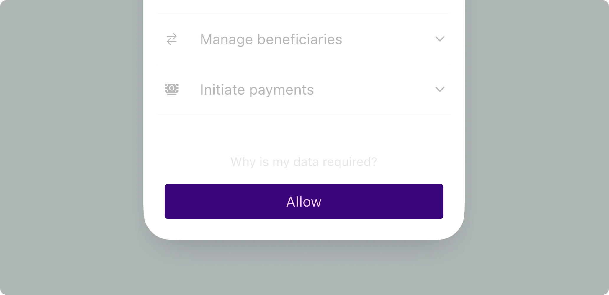
Button radius
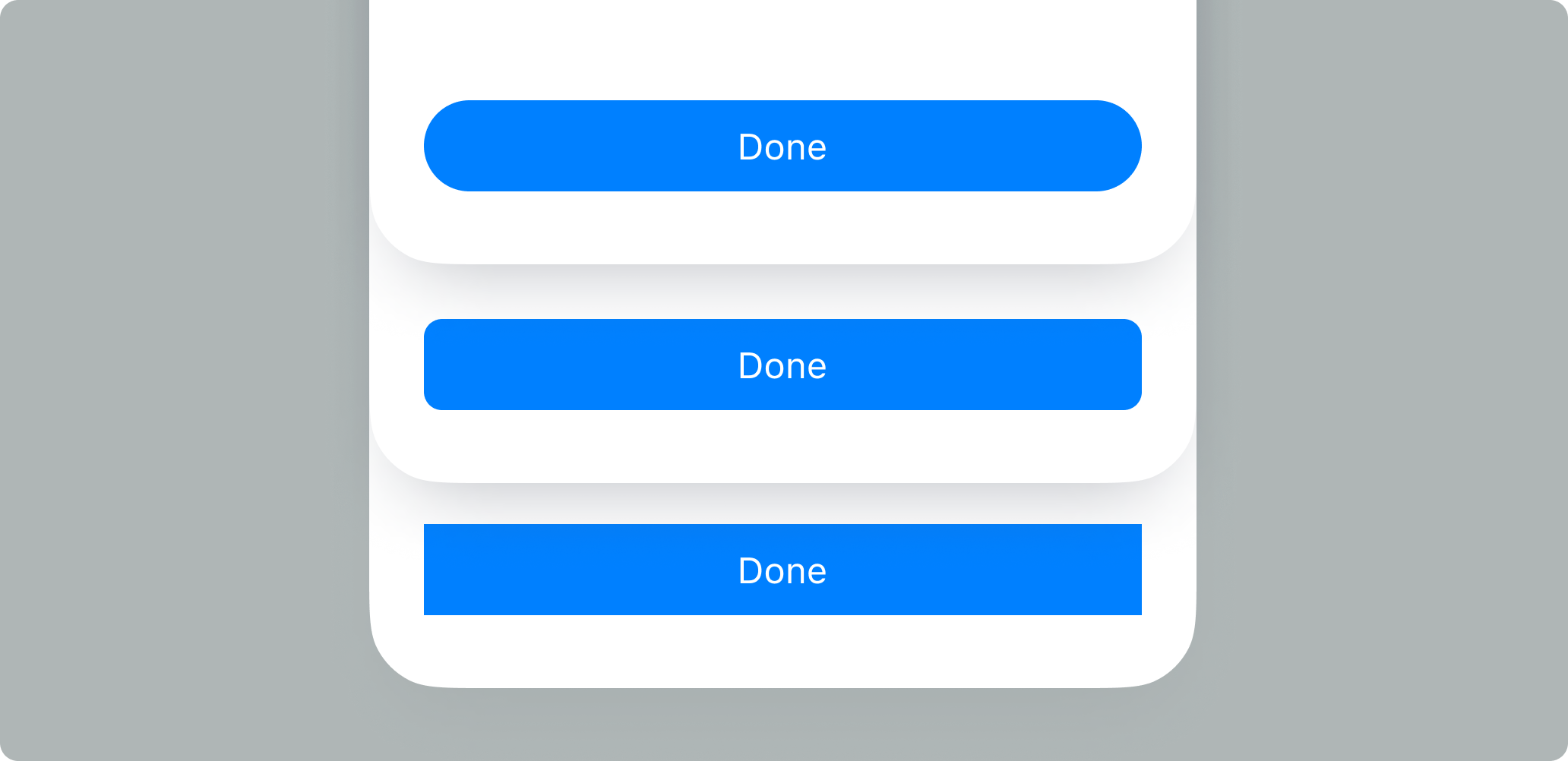
By default Link SDK buttons are shaped as rounded rectangles. This default border radius can be modified by setting an integer value to the button_border_radius property in the customization configuration to reflect the shape of the buttons in your application.
Link color
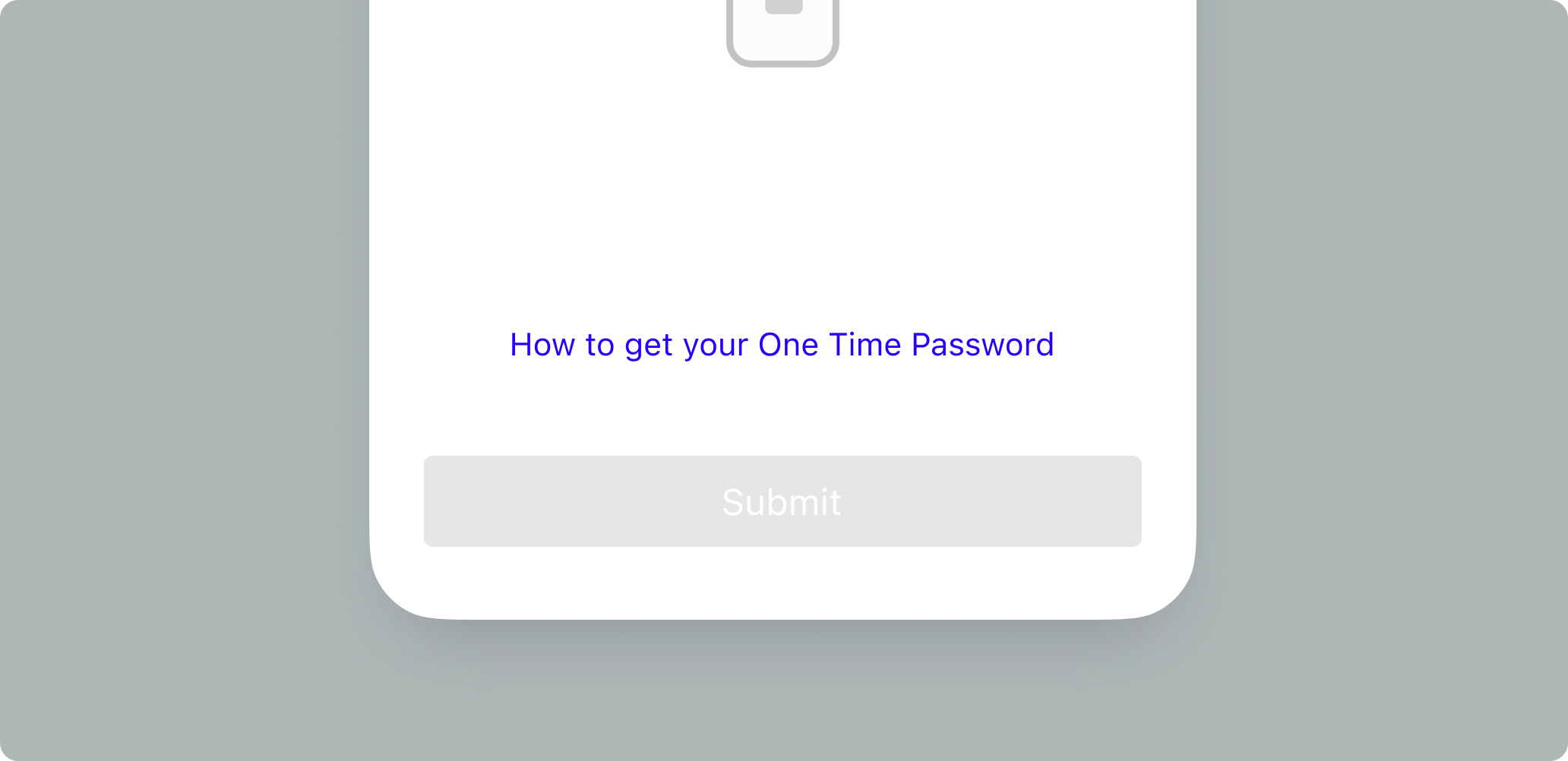
Links help your customers understand requirements or terms. With the link_color property you can adjust the colors of the Links and CTAs to match the ones in your system.
Overlay color
Link SDK works as a modal dialog overlaying the current context. The overlay modal background color can be changed from the overlay_color property to match the colors and transparencies used across your application.
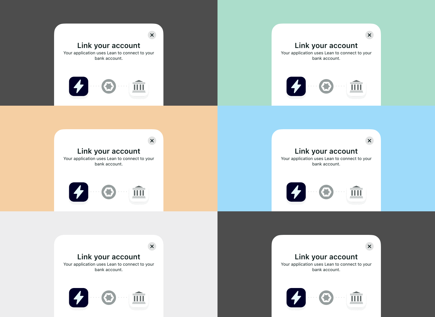
Best practices
When building your products, helping your customers connect their accounts should be priority over the styling of the platform. One of the core pillars of helping the users succeed is UX continuity and discoverability.
The dialogMode property is helpful to use the full area of native OS modal sheets and avoid shape-clashing if your application is styled with a different border radius. We still recommend enclosing the SDK within a modal overlay box to focus your users attention into completing the flow.
In Link SDK the buttons and links help users complete their flows. These are styled to be recognizable and differentiated from the rest of the elements in the view. We recommend theming them according to your application schemes and in a way they don’t disrupt the connection experience.
Although a variety of CSS color formats are supported, we recommend using HEX.
Mistakes to avoid
If you’re embedding the SDK within your own layout and not as an overlay dialog (ie. An onboarding flow), do not populate the surrounding view with interactive elements such as menus and links that could lead to abandonment.
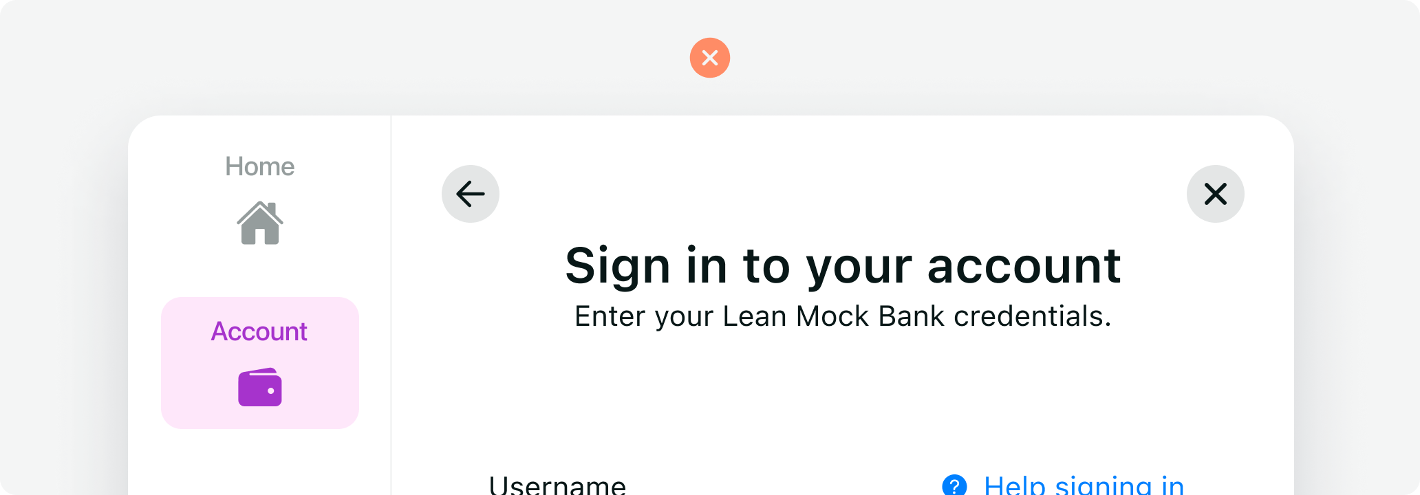
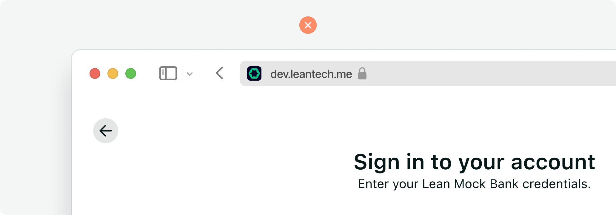
In desktop, we don’t recommend extending the Link SDK to a fullscreen view (viewport’s full width and height) or on a separate pop-up window as it might result in disruption to the user journey, loss of context, and unexpected errors.
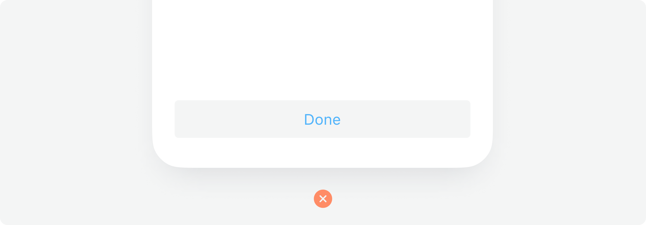
Avoid complex styling or transitions that could result in a laggy experience for users with legacy browsers or low performing devices.
Do not overlay elements on top of the Link SDK flow such as support bubbles, notifications, logos, or other dialogs.
Avoid setting "ghost" or light tints for the theme_color as these will blend with the SDK white background affecting discoverability.
Avoid using red as this is used to indicate "danger" or failure, in the standard Link SDK UI.
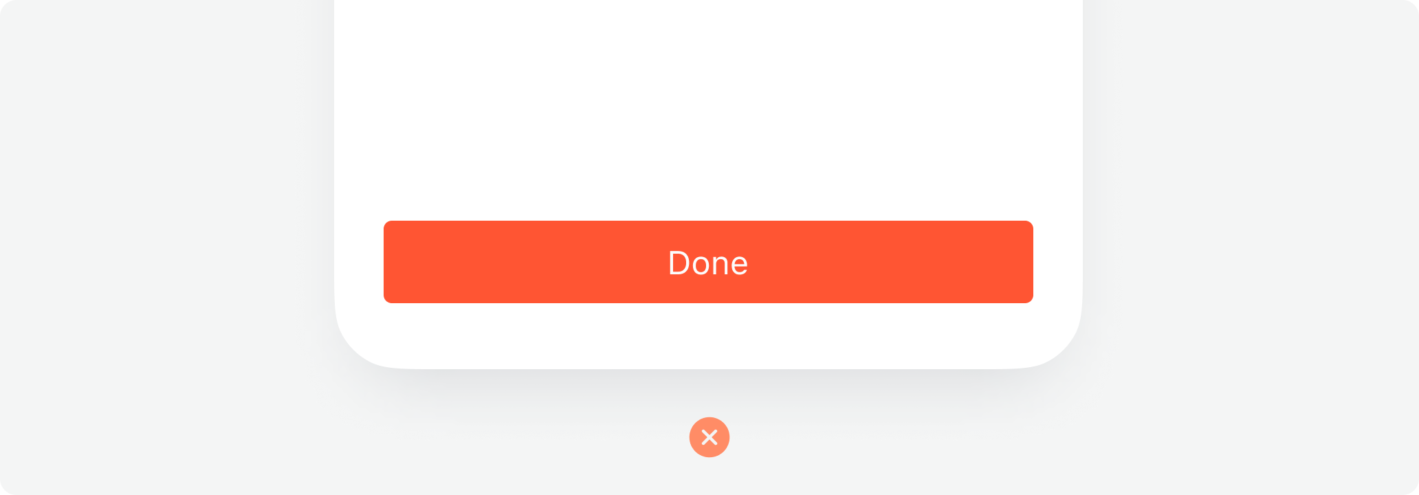
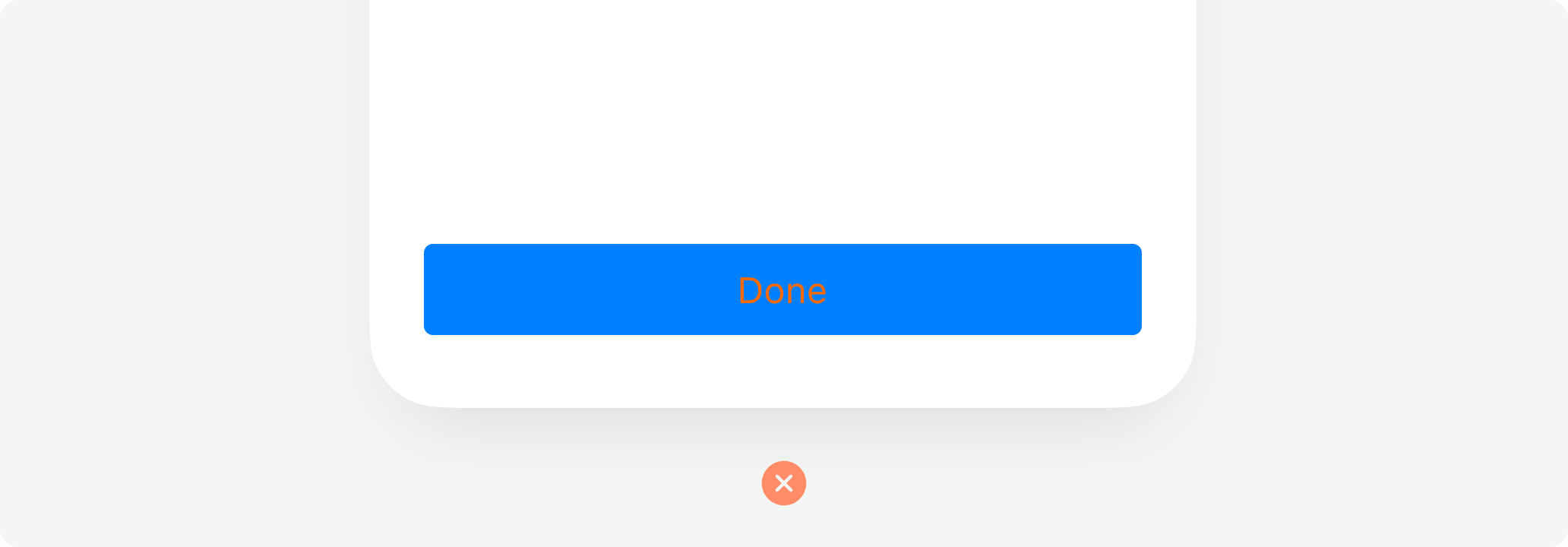
Don't use colors that may produce uncomfortable vibrations or clash with the schemes.
Updated over 1 year ago
