
Customization

Pass a customization object on any SDK method to override the default Link SDK appearance. All fields are optional — omit any you don't want to override and the SDK falls back to its defaults.
Lean.connect({
  app_token: "...",
  customer_id: "...",
  permissions: ["identity", "accounts"],
  customization: {
    theme_color: "#0080ff",
    button_text_color: "#ffffff",
    link_color: "#0080ff",
    overlay_color: "rgba(0, 0, 0, 0.8)",
    button_border_radius: "8",
    dialog_mode: "contained",
    // Dark mode overrides
    theme_color_dark: "#1a1a1a",
    button_text_color_dark: "#ffffff",
    dialog_background_color_light: "linear-gradient(#FFFFFF, #F5F7FA)",
    dialog_background_color_dark: "linear-gradient(#0F0F10, #1A1A1B)",
    force_appearance: "light",
  },
});
Where customisation appliesThe shape of the
customizationobject is identical on Web, iOS, Android, React Native, and Flutter. Mobile wrappers translate field names between snake_case and their native conventions. See each platform doc for the exact call site.
Company logo
Add a logo that appears on the "Link your account" screen by uploading it in the Settings section of the Lean developer account. It's applied to every SDK session launched by that application — no config field required.
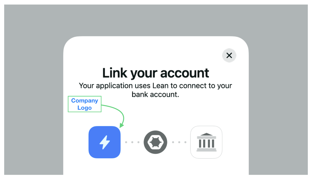
Optimal dimensionsUse a 400×400 square PNG for the best rendering across all platforms.
Accepted colour formats
Every colour field (theme_color, link_color, overlay_color, etc.) accepts:
| Format | Example |
|---|---|
| Hex | "#000000" |
| Shorthand hex | "#000" |
| Hex with alpha | "#000000FF" |
| Comma-separated RGB | "rgb(0, 0, 0)" |
| RGBA with alpha | "rgba(0, 0, 0, 0.5)" |
| CSS colour name | "black" |
Invalid colour strings throw CONFIG_ERROR__INVALID_PARAM_TYPE at SDK open time. We recommend sticking with hex for consistency across platforms.
Dialog background fields (dialog_background_color_light, dialog_background_color_dark) additionally accept CSS linear gradients — see Gradient backgrounds.
Presentation
dialog_mode
dialog_modeControls how the SDK is presented within the host page or view.
| Value | Effect |
|---|---|
"contained" (default) | Rendered inside a bordered dialog with the default Lean shape. |
"uncontained" | Renders edge-to-edge in the host container. Useful if you already wrap the SDK in a native modal sheet or your own dialog with a different border radius / shadow. |

button_border_radius
button_border_radiusShape of the primary call-to-action button on each screen.
| Value | Shape |
|---|---|
"0" | Rectangle — sharp corners. |
"4" (default) | Slightly rounded. |
"8" | More rounded. |
"pill" | Fully rounded regardless of button height. |
Any positive number is accepted (passed in pixels).

Light-mode colours
theme_color
theme_colorDrives the primary button background, active input borders, and loading-spinner colour.

button_text_color
button_text_colorColour of everything inside primary buttons — the label, icons, and loading spinner. Tune this to maintain a WCAG-compliant contrast ratio against theme_color.

link_color
link_colorColour of inline links and secondary CTAs (e.g. "Learn more", "Having trouble?" helpers).

overlay_color
overlay_colorBackground colour of the modal overlay behind the SDK dialog. Typically a translucent black or brand-tinted colour.

Dark-mode colours
The SDK follows the host device's preferred appearance by default. When the host reports dark mode, dark-mode overrides (if provided) replace their light-mode counterparts.
theme_color_dark
theme_color_darkDark-mode override for theme_color. When the user's device is in dark mode, the SDK uses this value instead.
button_text_color_dark
button_text_color_darkDark-mode override for button_text_color.
If you omit dark-mode overridesThe SDK will use your light-mode values in dark mode. That usually works for neutral palettes but can break contrast with strongly branded themes — specify the dark variants explicitly if you rely on brand colours that contrast poorly against dark backgrounds.
Dialog backgrounds
dialog_background_color_light
dialog_background_color_lightBackground of the SDK dialog when the host is in light mode. Accepts any colour format or a CSS linear gradient.
dialog_background_color_dark
dialog_background_color_darkSame, for dark mode.
Gradient backgrounds
Both dialog-background fields accept CSS linear gradients of the form:
linear-gradient(<colours>)Examples:
{
  dialog_background_color_light: "linear-gradient(#FFFFFF, #F5F7FA)",
  dialog_background_color_dark:  "linear-gradient(180deg, #0F0F10, #1A1A1B)",
}
The value is validated against the regex /^linear-gradient\([^)]+\)$/. Any well-formed linear-gradient(...) expression that CSS accepts will render correctly in the SDK WebView.
Radial gradients and multi-stop syntax that contains additional () (e.g. linear-gradient(red, rgb(0,0,0))) are not supported — the validator rejects nested parentheses.
Forcing appearance
force_appearance
force_appearanceOverrides the host device's system appearance for the duration of the SDK session.
| Value | Effect |
|---|---|
"light" | SDK renders in light mode even if the device is in dark mode. |
"dark" | SDK renders in dark mode even if the device is in light mode. |
| (omitted) | SDK follows the host device's system appearance. |
Use this when your own app is locked to a specific theme and you want the SDK to match — e.g. if your product is strictly light mode, force_appearance: "light" avoids a jarring dark-mode SDK popping up inside a light-mode host.
Best practices
- Prioritise users over branding. The first job of the SDK is to help the customer complete the flow. Heavy customisation that reduces discoverability of buttons and links lowers conversion.
- Use
dialog_mode: "uncontained"sparingly. It's useful when you're wrapping the SDK in your own sheet, but losing the SDK's own container can make the UI feel unmoored. Still wrap it in a modal overlay when you do. - Keep contrast ratios WCAG-compliant. Especially between
theme_colorandbutton_text_color. - Specify both light and dark variants if your theme depends on branded colours. Otherwise the SDK will reuse your light colours in dark mode, which usually ruins contrast.
- Stick with hex across platforms — RGB and named colours are accepted but hex is the most portable format between platforms.
Mistakes to avoid
Don't surround the embedded SDK with interactive elements. If you're using dialog_mode: "uncontained" inside an onboarding screen, avoid nearby menus, links, or buttons that could lead to flow abandonment.

Don't expand the SDK to fullscreen on desktop. Fullscreen breaks context and causes unexpected errors in some browser configurations.

Avoid transitions or effects on the containing dialog. Complex CSS transforms can cause lag or rendering bugs in the SDK WebView on low-end devices.
Don't overlay elements on top of the SDK. No support bubbles, chat widgets, banner notifications, or tooltips on top of the SDK flow — they steal focus and break the completion loop.
Don't use "ghost" or light-tinted theme colours. They blend with the SDK's white background and hurt button discoverability.

Don't use red as the theme colour. Red is reserved for errors and "danger" states in the SDK UI; overriding the primary theme to red creates confusing UI where success buttons look like error buttons.

Avoid vibrating colour combinations. Complementary extremes (hot pink on bright green, etc.) cause optical vibration that hurts readability.

Updated 3 months ago